Radical Times!
Workshop, sculpture and performance, June 30th, 2023
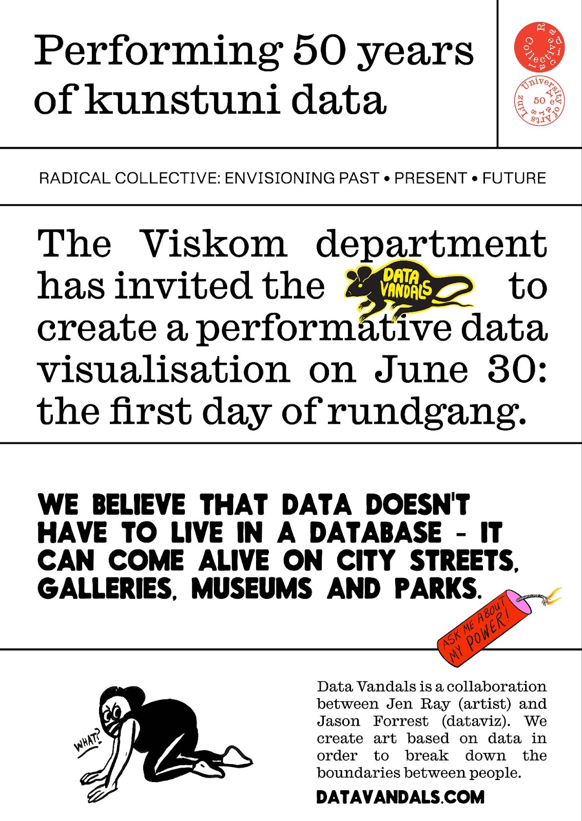
This past summer, the Data Vandals went international, as we were invited to create a collaborative project with the graduate students of the VisCom department at the Kunstuniversität Linz, an art and design school in Linz, Austria. This was part of the school’s 50th anniversary celebration and part of a larger program called “Radical Collective.” We were invited by our friend Tina Frank, who chairs the VisCom department and has a long history of media-based social interventions.
Photos by Violetta Wakolbinger or the Data Vandals
read the full article here:
Data Vandals Take to the Streets - of Linz!
Getting started
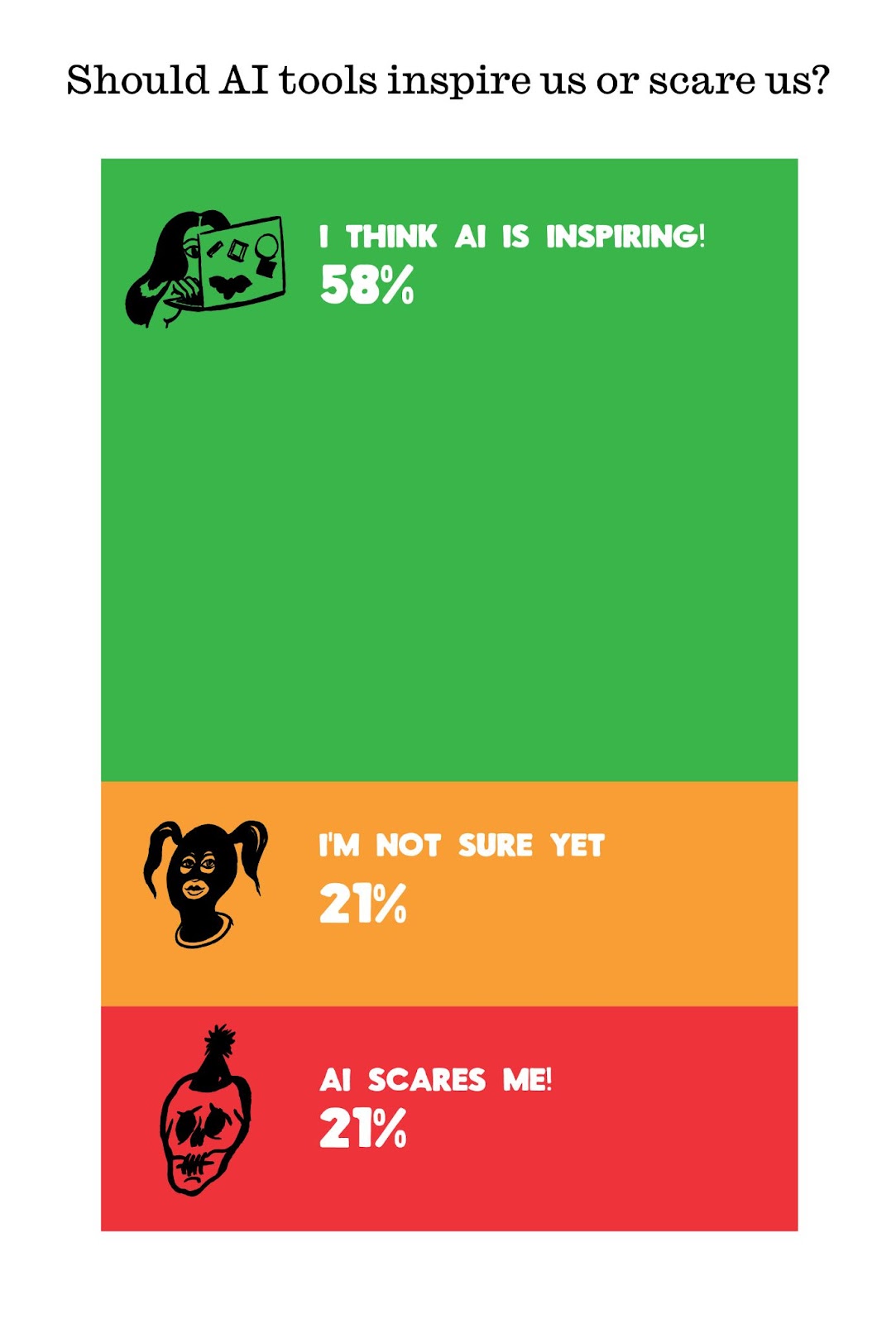
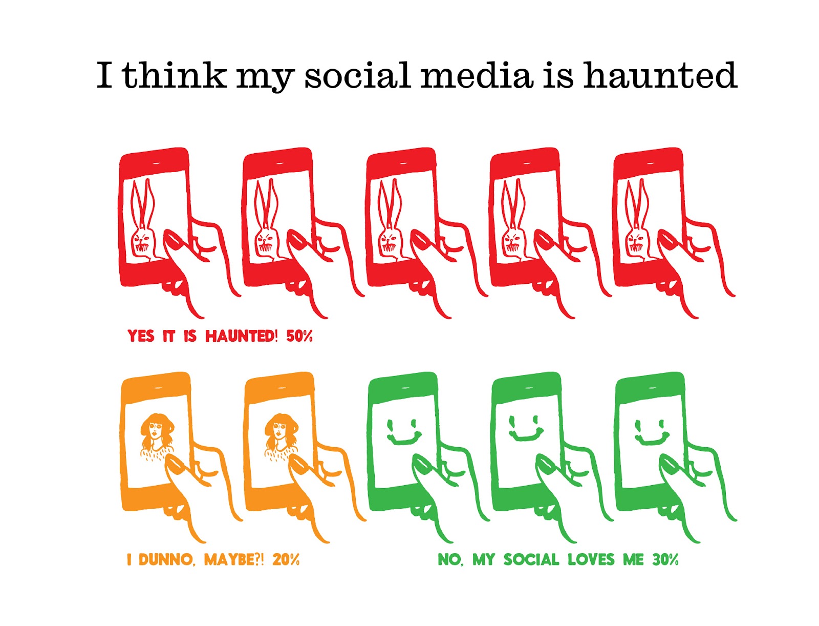
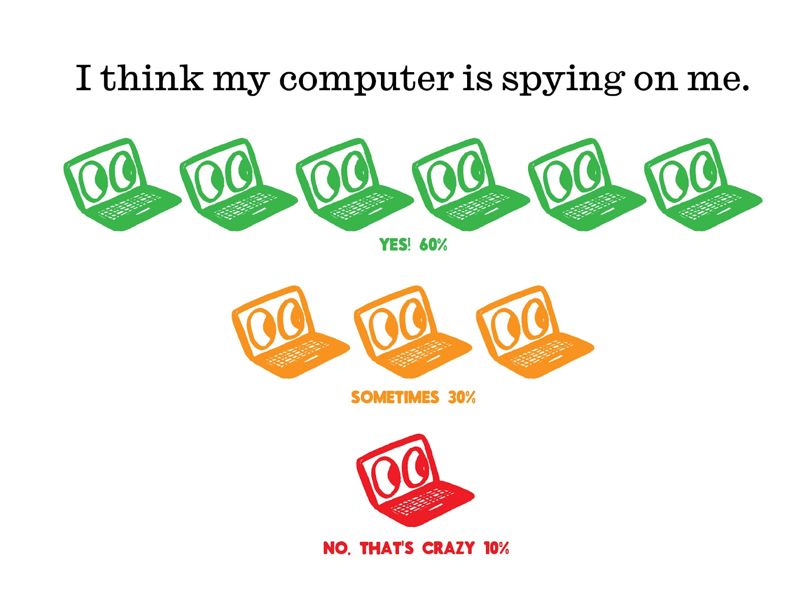
There were a lot of unknowns as we started the project, but we start any project by trying to understand our communication objectives. After exploring some options on what data we could use, we decided to focus on the students’ thoughts, feelings, and attitudes about art, careers, and genAI.
In addition, our project would also act as an index of the graduate student projects which would be exhibited at the same time. The combined artworks would be presented as part of a public exhibition on the main square of Linz.
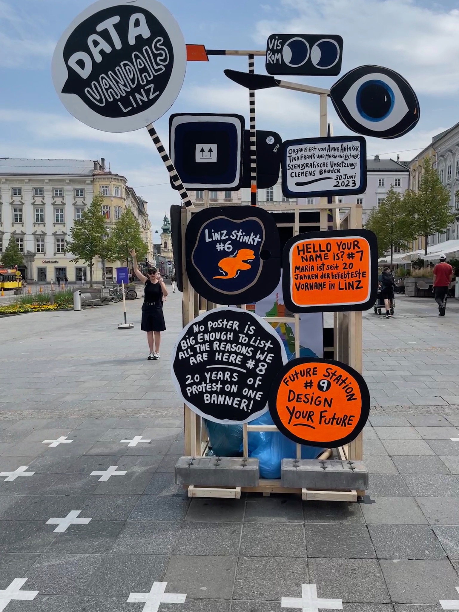
We decided to gather the data and student details into a Data Vandals kiosk. While talking with architecture professor Clemens Bauder, we all agreed to take inspiration from Herbert Bayer’s “Design for a Newspaper Kiosk” from 1924, while using simple materials of wood, cardboard, and hand painted signs. We also agreed to create a performance next to the kiosk that drew on anecdotal data from the assembled audience.

Herbert Bayer, Design for a newspaper kiosk, 1924 link
Collecting the data
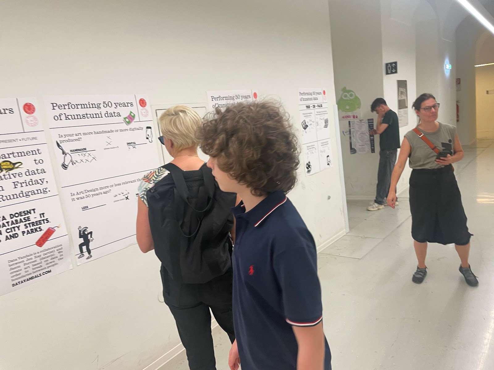
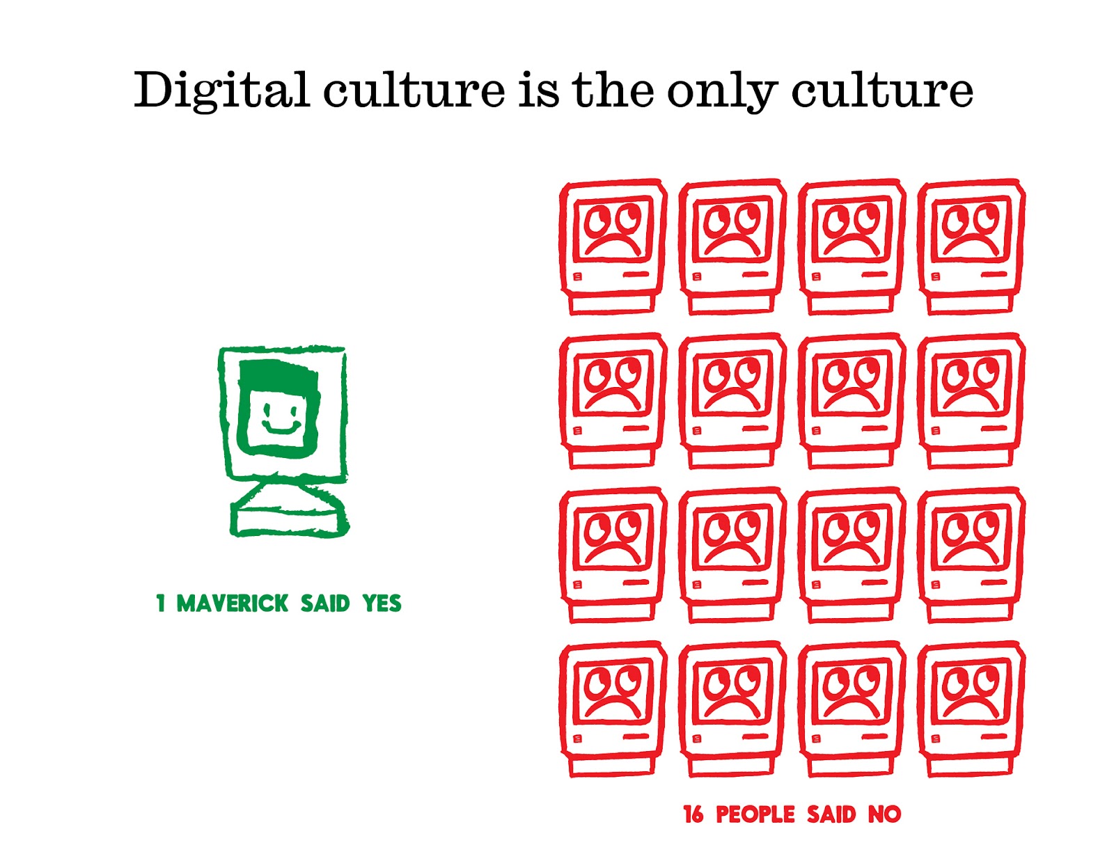
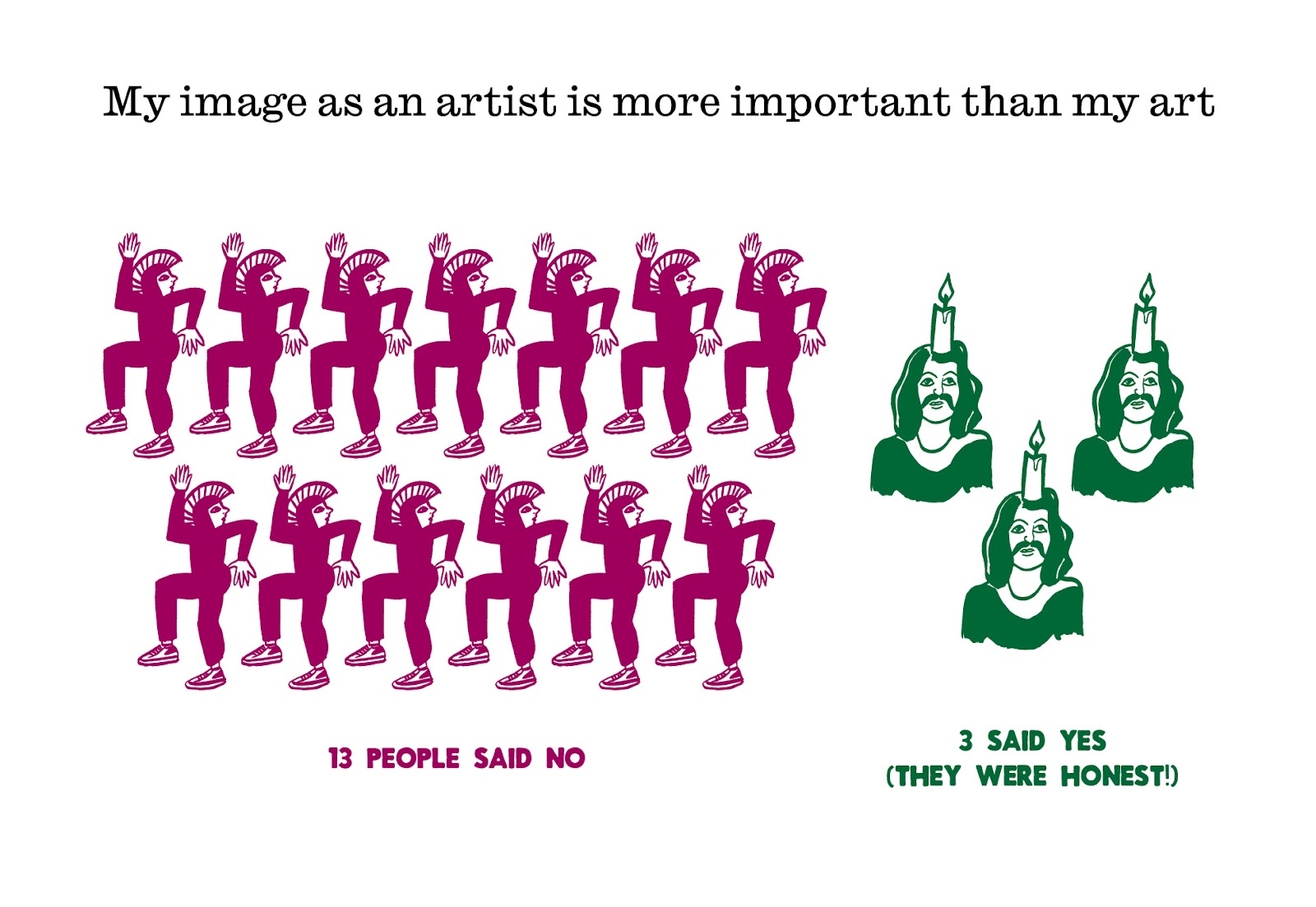
In order to collect data from the students, we created a series of posters with survey questions. These poster surveys were placed around the art school near different departments and were designed to set an irreverent tone. As you can see from the photos below, the students gladly vandalized the posters with their data just as we had asked them to!
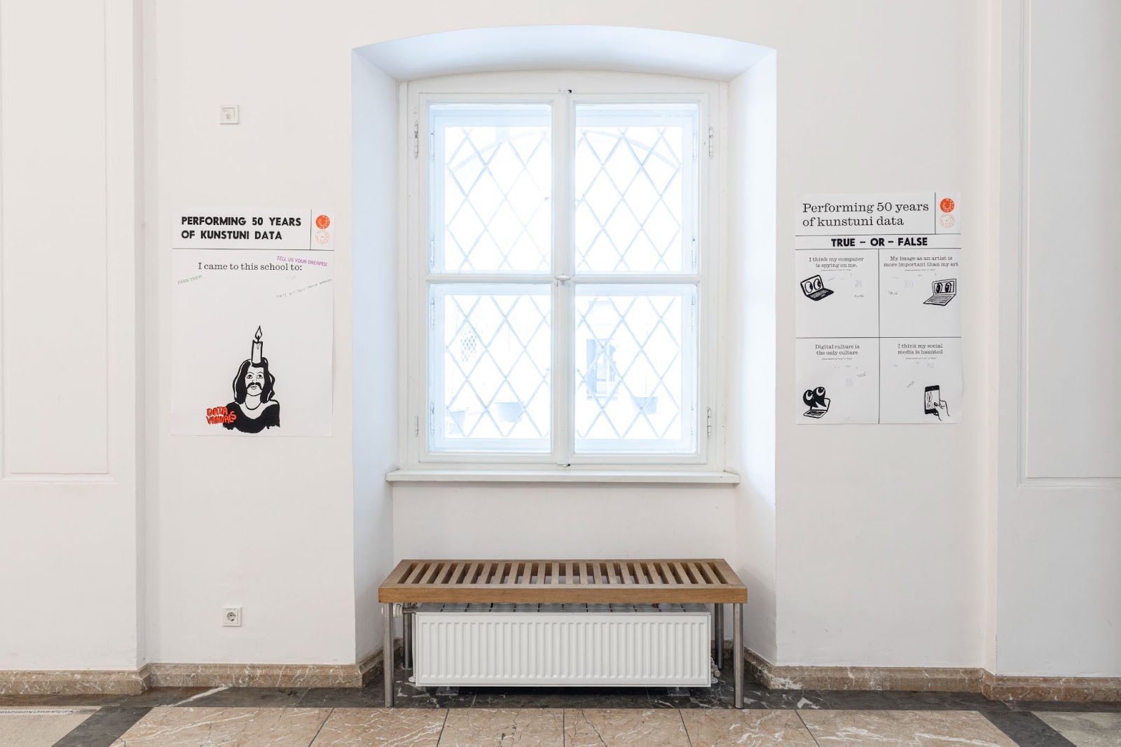
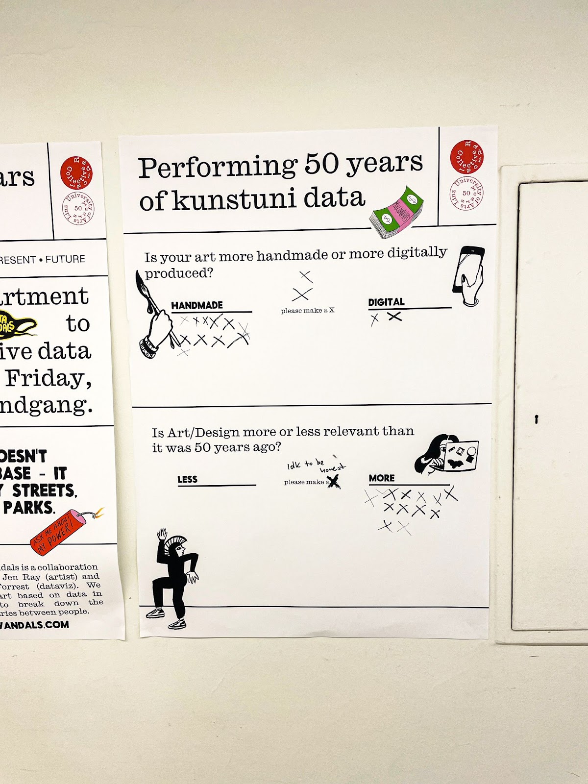
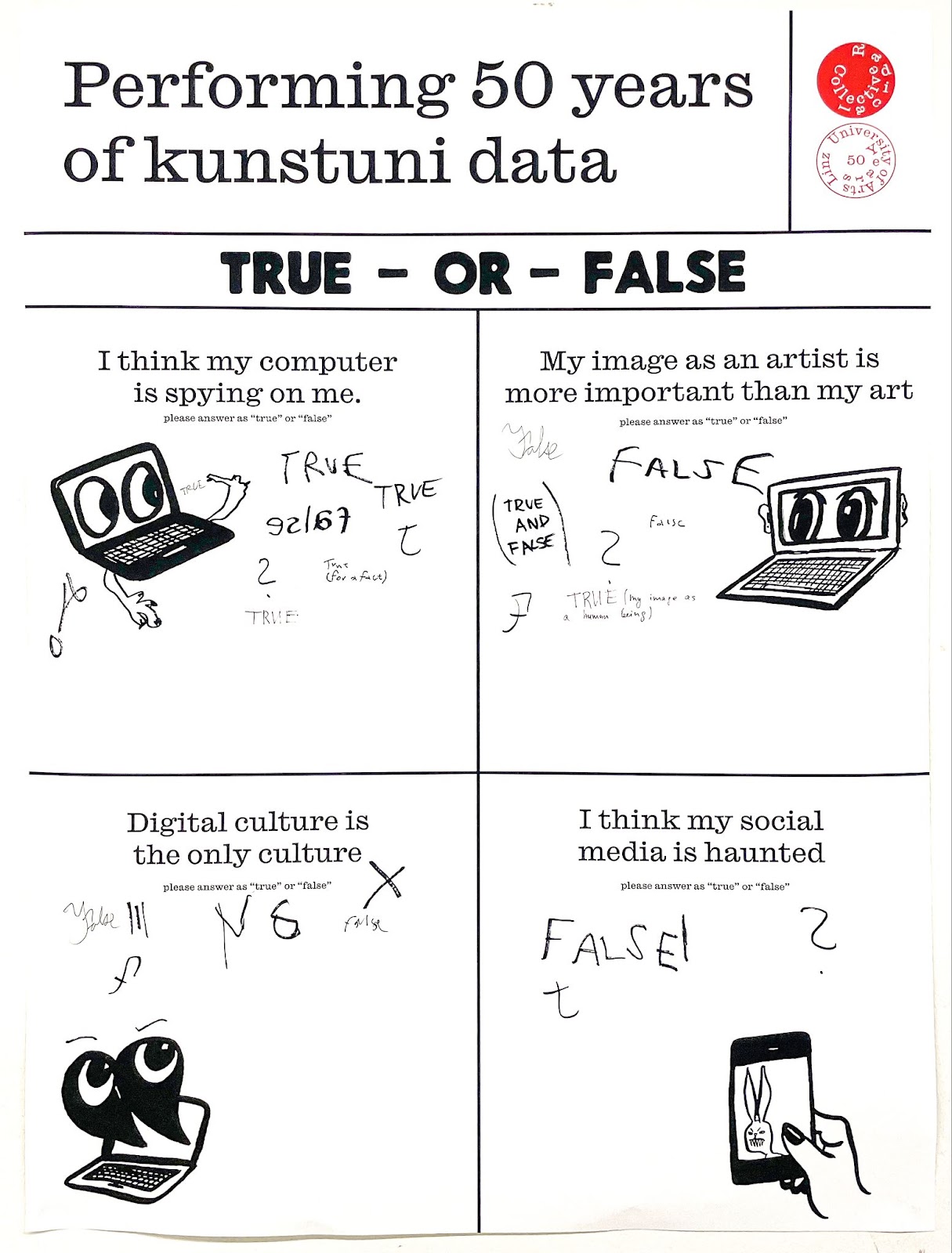
After collecting the data from the posters, we created a series of isotype-inspired designs using icons from the original posters. We printed some of the posters quite large, which helped us to think about how people react to the designs when printed at scale. Since we are used to seeing charts online or as posters, seeing an isotype printed at a human scale creates a completely different emotional attachment to the image and elevates the importance of the data. In the end, we opted for a medium-size poster so that the overall design of the kiosk was more cohesive.
From there, we met with each student to extract some of their data to create an index of the rest of the exhibition. Combined with the poster data, this became the material for our sculpture and performance.
Let’s get dirty!
It was time to build and paint the sculpture. Even our teenage son, Wolfgang, got involved with the construction and worked alongside the other artists in the woodshop. As the kiosk was being built, we discovered an intuitive way to organize the data by filling two sides of the kiosk with data from the student projects and the other two sides with data from the poster surveys. To make the design as vibrant as possible, we added several whirligigs to catch the wind as well as a full-sized Data Vandals flag.


Radical Times – The Exhibition
The only thing left to do was to set up the exhibition — and it went off without a hitch despite being threatened by some ominous storm clouds (potentially a problem given out simple materials!). The exhibition was installed at the foot of Linz’s Pestsäule; a baroque column celebrating survival over pestilence and war, set in one of the oldest plazas in Europe. The citizens and tourists of Linz wandered the exhibits asking questions and joking with the students, obviously enjoying their surprise data encounter.
Our kiosk and the 10 additional student projects were collected together under the title “Radical Times.” The title of the show was shouted many times through a bullhorn held by Tina Frank.. In the video below you can hear her addressing the citizens of Linz.


Beach Balls of Data!
The only thing left was our performance, but we only had a few minutes to dash through it to beat the rain! This performance was a lot more fun than we planned as we again experimented with the format. We took the student survey data and broke it into deciles. Then, we painted a bunch of inflatable beach balls with one side orange, the other side as blue, and few as white. From here we asked for 10 volur chart. For fun, we threw the balls back and forth and it turned into more of a “community” action with a lot of laughter! It was fun chaos but for each data point, you could see people really got into the action of playing with the data.


Bonus track – The Bar Chart
Our host, Tina Frank, had the idea to celebrate the exhibition with a “data drink” reception! She built out the idea with her students and we knew it was an awesome idea. The contents of the drink were based on the relationship between temperature change and rainfall levels in Linz – as temperatures have risen, rainfall has fallen. The customer had three choices: 2002, 2022, 2042. Drinks in 2042 had more alcohol and just a bit of water whereas drinks in 2002 were much more balanced and tasted much better. It was a hit! While many people unsurprisingly went with the stronger drinks, the 3 time periods provided some ability to modulate how much alcohol you drank, and each round brought a discussion on climate change.

We learned a lot AND had fun doing it
As I mentioned before, we consider all our projects to be experiments, and this project was one of the most interesting and successful. The deeply collaborative process allowed us to build something unique, and the students and citizens of Linz really responded to the design and overall feel of the kiosk. We were delighted to be part of this exhibit and just loved working with Tina, the professors of the VisCom department, and the students in the program.
There are a few big lessons that we learned on this project. It helped us see the immediacy of our data on the students and professors as many of them graduated or looked towards their next year of school. It helped us understand how the scale and playful design of our kiosk helped to capture people’s attention. But most of all, we realized that we were able to connect with a community through data visualization by collaborating with the students and becoming a part of their community, at least for a few days.
MEGA THANK YOU
Faculty: Tina Frank, Anna Artaker, Marianne Lechner, Clemens Bauder
Students: Liza Belkevich, Martha Büchel, Louisa Clever, Leyla Dehring, Sebastian Dorner, Lisa Endresz, Alisa Matern, Mario Moder, Sophie Morelli, Anna Painer, Philip Paulus, Liza Rashica, Rosalie Siegl, Ivan Sukhov
Special thanks to our friend Markus Fiedler for all his support and fun!